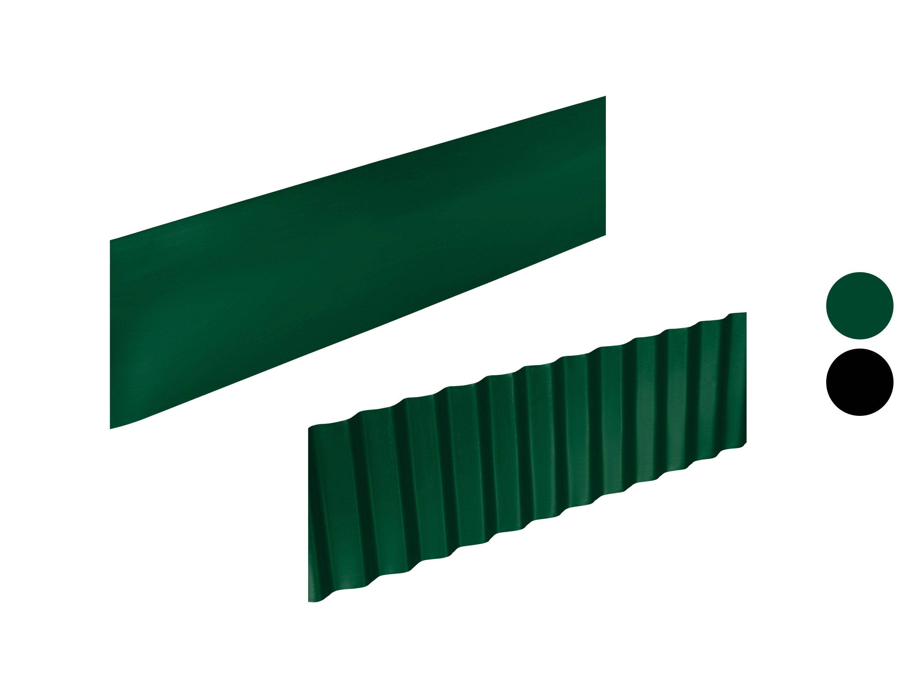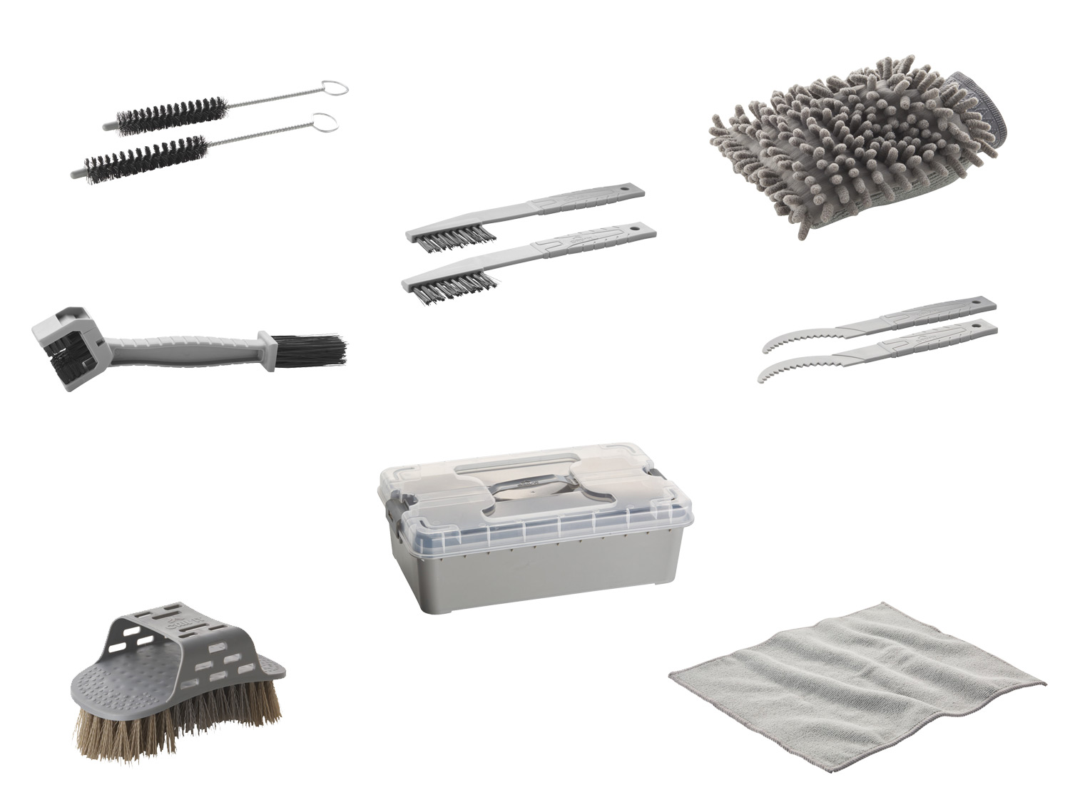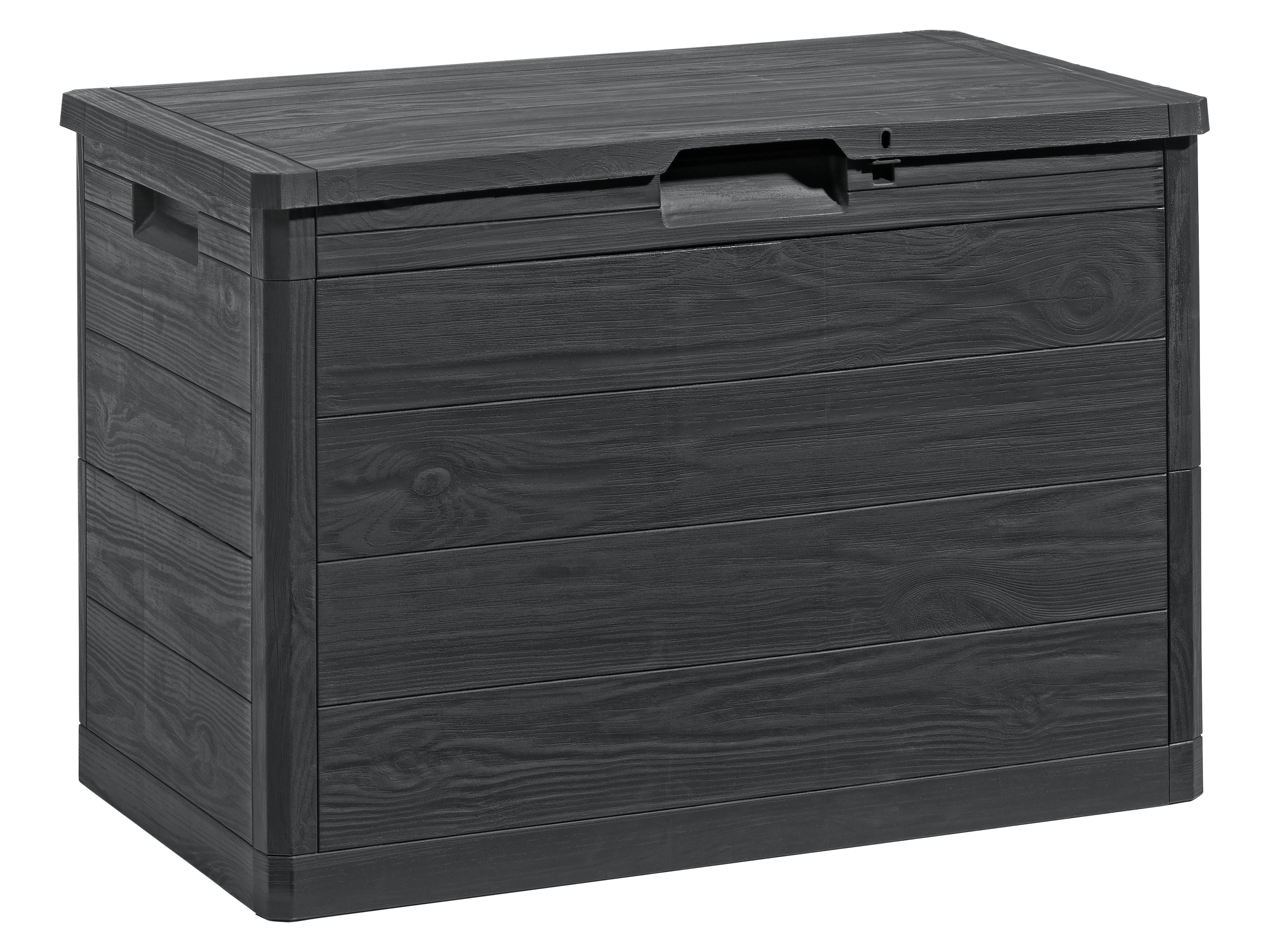
Livarno Home coffre de jardin, 160 l
Livarno home coffre de jardin, 160 l caractéristiques fabriqué à 100 % à partir de plastique recyclé pour une utilisation en intérieur et en extérieur construction robuste en matériau résistant aux intempéries et aux uv montage simple sans outil idéal pour les outils de jardin, les outils ou les accessoires dirrigation avec 2 poignées de transport avec dispositif de verrouillage (cadenas non inclus) caractéristiques du produit table{width:100%;}td{padding-right: 30px; padding: 0.
5rem; border-bottom: 0.
0625rem solid #e3e4e5;} tr:nth-child(odd) {background-color: #f2f3f4;} couvercle: oui capacité: environ 160 l matériau: 100 % plastique recyclé; plastic = 85 % pcr, colour (masterbatch), filler pcr – matière recyclée post-consommation dimensions : environ l 77,5 x h 52,7 x p 44,5 cm poids: environ 3,93 kg.
flex_1_left {width: 50%;text-align: center;margin-top: auto;margin-bottom: auto;padding-right: 10px;}.
flex_1_left.
text_align_left {text-align: left;}.
flex_1_right {width: 50%;margin-top: auto;margin-bottom: auto;padding-left: 10px;}.
bild_flexbox_links {border-radius: 10px;}.
flex_2_left {width: 50%;margin-top: auto;margin-bottom: auto;padding-right: 10px;}.
flex_2_right {width: 50%;text-align: center;margin-top: auto;margin-bottom: auto;padding-left: 10px;}.
flex_2_right.
text_align_right {text-align: right;}.
rounded-corners {max-width: 100%;border-radius: 10px;}.
heading_h2_custom_hybris {margin-top: 0;margin-bottom: 1rem;font-size: 1.
75rem;line-height: 30px;}.
heading_h3_custom_hybris {margin-top: 0;margin-bottom:.
5rem;font-size: 1.
5rem;font-weight: 700;line-height: 1.
width_full {margin-bottom: 30px;margin-left: 0;margin-right: 0;}.
width_full.
padding_around_15px {padding: 15px;}.
width_full.
padding_around_15px.
text_align_center {text-align: center;}.
width_30 {width: 30%;}.
width_30.
text_align_center {text-align: center;}.
image_hybris_features {max-width: 90%;border-radius: 10px;margin-bottom:.
75rem;}.
image_hybris_header_hochformat {width: 25%;max-width: 100%;border-radius: 10px;}.
image_hybris_header_querformat {width: 55%;max-width: 100%;border-radius: 10px;}.
bild_2er_flex {width: 50%;margin-top: auto;margin-bottom: auto;padding: 10px;}.
width_30-_4er_reihe {width: 30%;padding: 10px;}.
width_30-_4er_reihe.
text_align_center {text-align: center;}.
image_hybris_4er-features {max-width: 100%;border-radius: 10px;margin-bottom:.
75rem;}.
width_45 {width: 100%;}.
width_10 {width: 10%;}.
flex_label_left {align-self: flex-start;margin-right: 30px;}.
flex_label_left.
flex_align_start {width: 20%;text-align: center;align-self: flex-start}.
flex_label_right {align-self: flex-start;padding-left: 10px;}.
height_12 {height: 1rem;}.
zertifikat_img {object-fit: fill;}@media screen and (min-width: 1280px) {.
hybris_custom_container_1280 {font-size: 1.
125rem;}.
heading_h2_custom_hybris {font-size: 1.
875rem;font-weight: 700;line-height: 1.
heading_h3_custom_hybris {font-size: 1.
625rem;}}@media screen and (max-width: 991px) {.
hybris_custom_container_1280 {max-width: 1280px;}.
width_60 {width: 70%;}.
flexbox_custom_hybris.
flex_justify_hybris_space_between.
tablet-wrap {flex-wrap: wrap;}.
flex_1_left,.
flex_1_right {width: 50%;}.
width_full {width: 70%;}.
image_hybris_header_hochformat {width: 30%;}.
image_hybris_header_querformat {width: 65%;}.
bild_2er_flex {width: 60%;}.
width_30-_4er_reihe {width: 45%;}.
flex_label_left {width: 20%;}.
flex_label_right {width: 50%;}}@media screen and (max-width: 767px) {.
width_60 {width: 80%;}.
height_24 {height: 2rem;}.
flexbox_custom_hybris {flex-direction: column;}.
flex_1_left {width: 100%;text-align: center;padding-right: 0;}.
flex_1_left.
text_align_left {text-align: center;}.
flex_1_right {width: 100%;padding-left: 0;}.
flex_2_left {width: 100%;padding-right: 0;}.
flex_2_right {width: 100%;order: -1;padding-left: 0;}.
flex_2_right.
text_align_right {text-align: center;}.
width_full {width: 100%;}.
width_full.
padding_around_15px {padding-left: 0;padding-right: 0;}.
width_30 {width: 100%;margin-bottom: 30px;}.
image_hybris_features {max-width: 100%;}.
image_hybris_header_hochformat {width: 40%;}.
image_hybris_header_querformat {width: 75%;}.
bild_2er_flex {width: 100%;}.
width_30-_4er_reihe {width: 100%;margin-bottom: 30px;}.
image_hybris_4er-features {max-width: 100%;}.
centered {text-align: center;}.
icon_hybris_feature {max-width: 100%;}.
width_45 {margin-bottom: 30px;}.
flex_label_left {width: 200px;margin-bottom: 20px;padding-right: 0;}.
flex_label_right {width: 100%;padding-left: 0;}.
height_12 {height: 2rem;}}@media screen and (max-width: 479px) {.
width_60 {width: 100%;}.
height_24 {height: 1rem;}.
flex_1_left {padding-right: 0;}.
bild_flexbox_links {width: 100%;}.
width_30 {margin-bottom: 40px;}.
image_hybris_header_hochformat {width: 55%;}.
image_hybris_header_querformat {width: 95%;}.
width_30-_4er_reihe {margin-bottom: 40px;}.
flex_label_left {padding-right: 0;}.
height_12 {height: 1rem;}}.