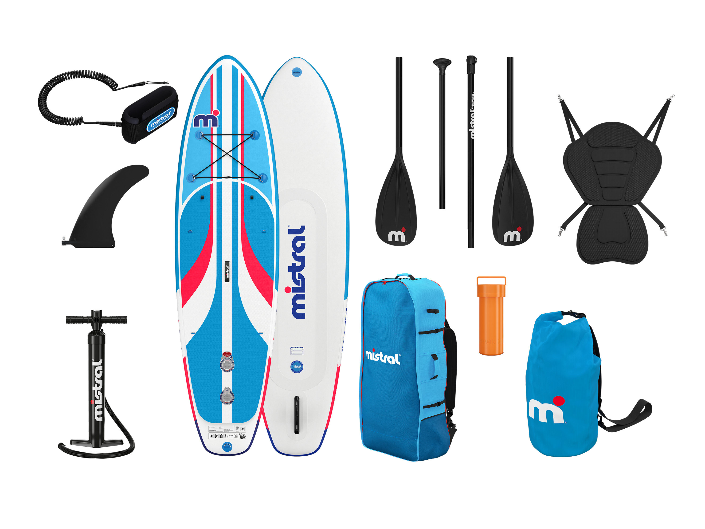
Mistral paddle sup gonflable
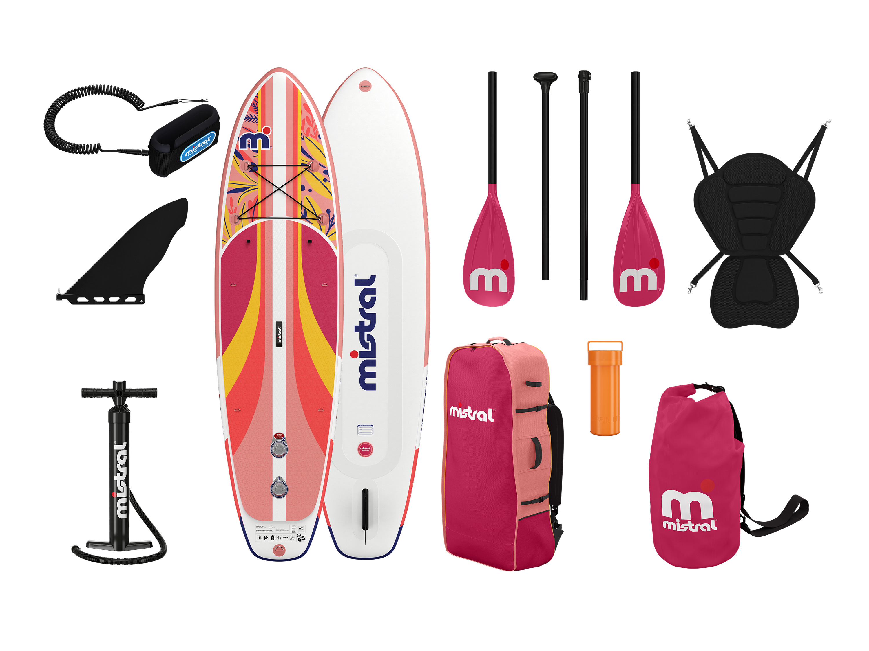
Mistral paddle sup gonflablele sup allround est une planche 2-en-1 qui peut être utilisée à la fois comme stand-up paddle et comme kayak.
il arbore une forme large qui garantit une grande stabilité au basculement et de nombreuses possibilités d’utilisation.
son matériau drop-stitch robuste et sa structure renforcée lui confèrent une rigidité et une durabilité accrues.
le sup allround « vivid » est doté d’une pagaie universelle réglable en longueur qui peut être transformée en pagaie double pour la fonction kayak.
son aileron assure une bonne maniabilité et évite que la planche ne s’accroche dans les algues.
son pad de pont antidérapant en eva avec coupe en diamant offre une meilleure stabilité, tandis que son tail kick pad permet de prendre des virages rapides.
facile à transporter grâce à la dragonne au milieu de la planche, le sup allround est également facile à stocker, car il peut être rangé dans un sac à dos pratique.
le sup allround « vivid » convient aux eaux protégées des lacs, des rivières et des baies.
flex_1_left,.
flex_2_right,.
hybris_custom_text_align_center,.
width_30-_4er_reihe.
text_align_center,.
width_30.
text_align_center,.
width_full.
padding_around_15px.
text_align_center{text-align:center}.
hybris_custom_container_1280{max-width:1280px;margin-right:auto;margin-bottom:1.
5rem;margin-left:auto;padding-right:0;padding-left:0;font-size:1rem}.
bild_flexbox_links,.
rounded-corners{max-width:100%;border-radius:10px}.
flex_1_left,.
flex_2_left{padding-right:10px}.
flex_1_right,.
flex_2_right{padding-left:10px}.
width_60{width:60%;margin-right:auto;margin-left:auto}.
flex_1_left,.
flex_1_right,.
flex_2_left,.
flex_2_right{width:50%;margin-top:auto;margin-bottom:auto}.
height_24{height:2rem}.
flexbox_custom_hybris{display:-webkit-box;display:-webkit-flex;display:-ms-flexbox;display:flex}.
flexbox_custom_hybris.
flex_justify_hybris_space_between{-webkit-box-pack:justify;-webkit-justify-content:space-between;-ms-flex-pack:justify;justify-content:space-between}.
heading_h2_custom_hybris{margin-top:0;margin-bottom:1rem;font-size:1.
75rem;line-height:30px}.
heading_h3_custom_hybris{margin-top:0;margin-bottom:.
5rem;font-size:1.
5rem;line-height:1.
2;font-weight:700}.
width_full{margin-right:0;margin-bottom:30px;margin-left:0}.
width_full.
padding_around_15px{padding:15px}.
width_30{width:30%}.
w-embed:after,.
w-embed:before{content: ;display:table;grid-column-start:1;grid-row-start:1;grid-column-end:2;grid-row-end:2}.
w-embed:after{clear:both}.
w-video{width:100%;position:relative;padding:0}.
w-video embed,.
w-video iframe{position:absolute;top:0;left:0;width:100%;height:100%;border:none}.
image_hybris_features{max-width:90%;margin-bottom:.
75rem;border-radius:10px}.
image_hybris_header_hochformat{width:25%;max-width:100%;border-radius:10px}.
image_hybris_header_querformat{width:55%;max-width:100%;border-radius:10px}.
bild_2er_flex{width:50%;margin-top:auto;margin-bottom:auto;padding:10px}.
width_30-_4er_reihe{width:30%;padding:10px}.
image_hybris_4er-features{max-width:100%;margin-bottom:.
75rem;border-radius:10px}.
width_45{width:100%}.
width_10{width:10%}@media screen and (min-width:1280px){.
hybris_custom_container_1280{font-size:1.
125rem}.
heading_h2_custom_hybris{font-size:1.
875rem;line-height:1.
2;font-weight:700}.
heading_h3_custom_hybris{font-size:1.
625rem}}@media screen and (max-width:991px){.
hybris_custom_container_1280{max-width:1280px}.
width_60,.
width_full{width:70%}.
flexbox_custom_hybris.
flex_justify_hybris_space_between.
tablet-wrap{-webkit-flex-wrap:wrap;-ms-flex-wrap:wrap;flex-wrap:wrap}.
flex_1_left,.
flex_1_right{width:50%}.
image_hybris_header_hochformat{width:30%}.
image_hybris_header_querformat{width:65%}.
bild_2er_flex{width:60%}.
width_30-_4er_reihe{width:45%}}@media screen and (max-width:767px){.
centered,.
flex_1_left{text-align:center}.
width_60{width:80%}.
height_24{height:2rem}.
flexbox_custom_hybris{-webkit-box-orient:vertical;-webkit-box-direction:normal;-webkit-flex-direction:column;-ms-flex-direction:column;flex-direction:column}.
flex_1_left{width:100%;padding-right:0}.
flex_1_right{width:100%;padding-left:0}.
flex_2_left{width:100%;padding-right:0}.
flex_2_right{width:100%;padding-left:0;-webkit-box-ordinal-group:0;-webkit-order:-1;-ms-flex-order:-1;order:-1}.
bild_2er_flex,.
width_full{width:100%}.
width_full.
padding_around_15px{padding-right:0;padding-left:0}.
width_30,.
width_30-_4er_reihe{width:100%;margin-bottom:30px}.
icon_hybris_feature,.
image_hybris_4er-features,.
image_hybris_features{max-width:100%}.
image_hybris_header_hochformat{width:40%}.
image_hybris_header_querformat{width:75%}.
width_45{margin-bottom:30px}}@media screen and (max-width:479px){.
bild_flexbox_links,.
width_60{width:100%}.
height_24{height:1rem}.
flex_1_left{padding-right:0}.
width_30,.
width_30-_4er_reihe{margin-bottom:40px}.
image_hybris_header_hochformat{width:55%}.
image_hybris_header_querformat{width:95%}}caractéristiques forme large pour une grande stabilité au basculement et de nombreuses possibilités d’utilisation 2-en-1 : utilisable également comme kayak en position assise matériau drop-stitch renforcé pour une rigidité accrue de la planche avec pagaie universelle réglable en longueur (environ 167-207 cm) – transformable en pagaie double pour la fonction kayak (environ 229 cm) 1 aileron pour une bonne maniabilité pad de pont antidérapant en eva avec coupe en diamant pour une meilleure stabilité tail kick pad pour des virages rapides système à double chambre de haute qualité pour une meilleure stabilité et une sécurité accrue avec filet à bagages élastique transport facile grâce à la taille compacte du paquet et au sac à dos pratique avec anneau en d en acier inoxydable pour attacher un leash (inclus, environ 300 cm) valves à visser haute pression pour un gonflage et un dégonflage faciles dragonne au milieu de la planche pour un transport facile et confortable du paddle gonflé anneau de remorquage sur le dessous de l’étrave pour fixer la planche à la bouée, au ponton et à la rive.
hybris_custom_container_1280 {max-width: 1280px;margin-right: auto;margin-bottom: 1.
5rem;margin-left: auto;padding-right: 0rem;padding-left: 0rem;font-size: 1rem;}.
hybris_custom_text_align_center {text-align: center;}.
width_60 {width: 60%;margin-right: auto;margin-left: auto;}.
height_24 {height: 2rem;}.
flexbox_custom_hybris {display: -webkit-box;display: -webkit-flex;display: -ms-flexbox;display: flex;}.
flexbox_custom_hybris.
flex_justify_hybris_space_between {-webkit-box-pack: justify;-webkit-justify-content: space-between;-ms-flex-pack: justify;justify-content: space-between;}.
flex_1_left {width: 50%;margin-top: auto;margin-bottom: auto;padding-right: 10px;text-align: center;}.
flex_1_right {width: 50%;margin-top: auto;margin-bottom: auto;padding-left: 10px;}.
bild_flexbox_links {border-radius: 10px;}.
flex_2_left {width: 50%;margin-top: auto;margin-bottom: auto;padding-right: 10px;}.
flex_2_right {width: 50%;margin-top: auto;margin-bottom: auto;padding-left: 10px;text-align: center;}.
rounded-corners {max-width: 100%;border-radius: 10px;}.
heading_h2_custom_hybris {margin-top: 0px;margin-bottom: 1rem;font-size: 1.
75rem;line-height: 30px;}.
heading_h3_custom_hybris {margin-top: 0px;margin-bottom: 0.
5rem;font-size: 1.
5rem;line-height: 1.
2;font-weight: 700;}.
width_full {margin-right: 0px;margin-bottom: 30px;margin-left: 0px;}.
width_full.
padding_around_15px {padding: 15px;}.
width_full.
padding_around_15px.
text_align_center {text-align: center;}.
width_30 {width: 30%;}.
w-embed:before,.
w-embed:after {content: ;display: table;grid-column-start: 1;grid-row-start: 1;grid-column-end: 2;grid-row-end: 2;}.
w-embed:after {clear: both;}.
w-video {width: 100%;position: relative;padding: 0;}.
w-video iframe,.
w-video embed {position: absolute;top: 0;left: 0;width: 100%;height: 100%;border: none;}.
width_30.
text_align_center {text-align: center;}.
image_hybris_features {max-width: 90%;margin-bottom: 0.
75rem;border-radius: 10px;}.
image_hybris_header_hochformat {width: 25%;max-width: 100%;border-radius: 10px;}.
image_hybris_header_querformat {width: 55%;max-width: 100%;border-radius: 10px;}.
bild_2er_flex {width: 50%;margin-top: auto;margin-bottom: auto;padding: 10px;}.
width_30-_4er_reihe {width: 30%;padding: 10px;}.
width_30-_4er_reihe.
text_align_center {text-align: center;}.
image_hybris_4er-features {max-width: 100%;margin-bottom: 0.
75rem;border-radius: 10px;}.
width_45 {width: 100%;}.
width_10 {width: 10%;}@media screen and (min-width: 1280px) {.
hybris_custom_container_1280 {font-size: 1.
125rem;}.
heading_h2_custom_hybris {font-size: 1.
875rem;line-height: 1.
2;font-weight: 700;}.
heading_h3_custom_hybris {font-size: 1.
625rem;}}@media screen and (max-width: 991px) {.
hybris_custom_container_1280 {max-width: 1280px;}.
width_60 {width: 70%;}.
flexbox_custom_hybris.
flex_justify_hybris_space_between.
tablet-wrap {-webkit-flex-wrap: wrap;-ms-flex-wrap: wrap;flex-wrap: wrap;}.
flex_1_left {width: 50%;}.
flex_1_right {width: 50%;}.
width_full {width: 70%;}.
image_hybris_header_hochformat {width: 30%;}.
image_hybris_header_querformat {width: 65%;}.
bild_2er_flex {width: 60%;}.
width_30-_4er_reihe {width: 45%;}}@media screen and (max-width: 767px) {.
width_60 {width: 80%;}.
height_24 {height: 2rem;}.
flexbox_custom_hybris {-webkit-box-orient: vertical;-webkit-box-direction: normal;-webkit-flex-direction: column;-ms-flex-direction: column;flex-direction: column;}.
flex_1_left {width: 100%;padding-right: 0px;text-align: center;}.
flex_1_right {width: 100%;padding-left: 0px;}.
flex_2_left {width: 100%;padding-right: 0px;}.
flex_2_right {width: 100%;padding-left: 0px;-webkit-box-ordinal-group: 0;-webkit-order: -1;-ms-flex-order: -1;order: -1;}.
width_full {width: 100%;}.
width_full.
padding_around_15px {padding-right: 0px;padding-left: 0px;}.
width_30 {width: 100%;margin-bottom: 30px;}.
image_hybris_features {max-width: 100%;}.
image_hybris_header_hochformat {width: 40%;}.
image_hybris_header_querformat {width: 75%;}.
bild_2er_flex {width: 100%;}.
width_30-_4er_reihe {width: 100%;margin-bottom: 30px;}.
image_hybris_4er-features {max-width: 100%;}.
centered {text-align: center;}.
icon_hybris_feature {max-width: 100%;}.
width_45 {margin-bottom: 30px;}}@media screen and (max-width: 479px) {.
width_60 {width: 100%;}.
height_24 {height: 1rem;}.
flex_1_left {padding-right: 0px;}.
bild_flexbox_links {width: 100%;}.
width_30 {margin-bottom: 40px;}.
image_hybris_header_hochformat {width: 55%;}.
image_hybris_header_querformat {width: 95%;}.
width_30-_4er_reihe {margin-bottom: 40px;}}2-en-1 : utilisable également comme kayak en position assisetail kick pad pour des virages rapides1 aileron pour une bonne maniabilité.
flex_1_left,.
flex_2_right,.
hybris_custom_text_align_center,.
width_30-_4er_reihe.
text_align_center,.
width_30.
text_align_center,.
width_full.
padding_around_15px.
text_align_center{text-align:center}.
hybris_custom_container_1280{max-width:1280px;margin-right:auto;margin-bottom:1.
5rem;margin-left:auto;padding-right:0;padding-left:0;font-size:1rem}.
bild_flexbox_links,.
rounded-corners{max-width:100%;border-radius:10px}.
flex_1_left,.
flex_2_left{padding-right:10px}.
flex_1_right,.
flex_2_right{padding-left:10px}.
width_60{width:60%;margin-right:auto;margin-left:auto}.
flex_1_left,.
flex_1_right,.
flex_2_left,.
flex_2_right{width:50%;margin-top:auto;margin-bottom:auto}.
height_24{height:2rem}.
flexbox_custom_hybris{display:-webkit-box;display:-webkit-flex;display:-ms-flexbox;display:flex}.
flexbox_custom_hybris.
flex_justify_hybris_space_between{-webkit-box-pack:justify;-webkit-justify-content:space-between;-ms-flex-pack:justify;justify-content:space-between}.
heading_h2_custom_hybris{margin-top:0;margin-bottom:1rem;font-size:1.
75rem;line-height:30px}.
heading_h3_custom_hybris{margin-top:0;margin-bottom:.
5rem;font-size:1.
5rem;line-height:1.
2;font-weight:700}.
width_full{margin-right:0;margin-bottom:30px;margin-left:0}.
width_full.
padding_around_15px{padding:15px}.
width_30{width:30%}.
w-embed:after,.
w-embed:before{content: ;display:table;grid-column-start:1;grid-row-start:1;grid-column-end:2;grid-row-end:2}.
w-embed:after{clear:both}.
w-video{width:100%;position:relative;padding:0}.
w-video embed,.
w-video iframe{position:absolute;top:0;left:0;width:100%;height:100%;border:none}.
image_hybris_features{max-width:90%;margin-bottom:.
75rem;border-radius:10px}.
image_hybris_header_hochformat{width:25%;max-width:100%;border-radius:10px}.
image_hybris_header_querformat{width:55%;max-width:100%;border-radius:10px}.
bild_2er_flex{width:50%;margin-top:auto;margin-bottom:auto;padding:10px}.
width_30-_4er_reihe{width:30%;padding:10px}.
image_hybris_4er-features{max-width:100%;margin-bottom:.
75rem;border-radius:10px}.
width_45{width:100%}.
width_10{width:10%}@media screen and (min-width:1280px){.
hybris_custom_container_1280{font-size:1.
125rem}.
heading_h2_custom_hybris{font-size:1.
875rem;line-height:1.
2;font-weight:700}.
heading_h3_custom_hybris{font-size:1.
625rem}}@media screen and (max-width:991px){.
hybris_custom_container_1280{max-width:1280px}.
width_60,.
width_full{width:70%}.
flexbox_custom_hybris.
flex_justify_hybris_space_between.
tablet-wrap{-webkit-flex-wrap:wrap;-ms-flex-wrap:wrap;flex-wrap:wrap}.
flex_1_left,.
flex_1_right{width:50%}.
image_hybris_header_hochformat{width:30%}.
image_hybris_header_querformat{width:65%}.
bild_2er_flex{width:60%}.
width_30-_4er_reihe{width:45%}}@media screen and (max-width:767px){.
centered,.
flex_1_left{text-align:center}.
width_60{width:80%}.
height_24{height:2rem}.
flexbox_custom_hybris{-webkit-box-orient:vertical;-webkit-box-direction:normal;-webkit-flex-direction:column;-ms-flex-direction:column;flex-direction:column}.
flex_1_left{width:100%;padding-right:0}.
flex_1_right{width:100%;padding-left:0}.
flex_2_left{width:100%;padding-right:0}.
flex_2_right{width:100%;padding-left:0;-webkit-box-ordinal-group:0;-webkit-order:-1;-ms-flex-order:-1;order:-1}.
bild_2er_flex,.
width_full{width:100%}.
width_full.
padding_around_15px{padding-right:0;padding-left:0}.
width_30,.
width_30-_4er_reihe{width:100%;margin-bottom:30px}.
icon_hybris_feature,.
image_hybris_4er-features,.
image_hybris_features{max-width:100%}.
image_hybris_header_hochformat{width:40%}.
image_hybris_header_querformat{width:75%}.
width_45{margin-bottom:30px}}@media screen and (max-width:479px){.
bild_flexbox_links,.
width_60{width:100%}.
height_24{height:1rem}.
flex_1_left{padding-right:0}.
width_30,.
width_30-_4er_reihe{margin-bottom:40px}.
image_hybris_header_hochformat{width:55%}.
image_hybris_header_querformat{width:95%}}système à double chambre de haute qualitéle sup est équipé d’un système à double chambre de haute qualité qui assure une meilleure stabilité et une sécurité accrue.
la planche est dotée d’un pad de pont antidérapant en eva, d’un aileron et d’un kick pad pour garantir une conduite sûre et confortable.
flex_1_left,.
flex_2_right,.
hybris_custom_text_align_center,.
width_30-_4er_reihe.
text_align_center,.
width_30.
text_align_center,.
width_full.
padding_around_15px.
text_align_center{text-align:center}.
hybris_custom_container_1280{max-width:1280px;margin-right:auto;margin-bottom:1.
5rem;margin-left:auto;padding-right:0;padding-left:0;font-size:1rem}.
bild_flexbox_links,.
rounded-corners{max-width:100%;border-radius:10px}.
flex_1_left,.
flex_2_left{padding-right:10px}.
flex_1_right,.
flex_2_right{padding-left:10px}.
width_60{width:60%;margin-right:auto;margin-left:auto}.
flex_1_left,.
flex_1_right,.
flex_2_left,.
flex_2_right{width:50%;margin-top:auto;margin-bottom:auto}.
height_24{height:2rem}.
flexbox_custom_hybris{display:-webkit-box;display:-webkit-flex;display:-ms-flexbox;display:flex}.
flexbox_custom_hybris.
flex_justify_hybris_space_between{-webkit-box-pack:justify;-webkit-justify-content:space-between;-ms-flex-pack:justify;justify-content:space-between}.
heading_h2_custom_hybris{margin-top:0;margin-bottom:1rem;font-size:1.
75rem;line-height:30px}.
heading_h3_custom_hybris{margin-top:0;margin-bottom:.
5rem;font-size:1.
5rem;line-height:1.
2;font-weight:700}.
width_full{margin-right:0;margin-bottom:30px;margin-left:0}.
width_full.
padding_around_15px{padding:15px}.
width_30{width:30%}.
w-embed:after,.
w-embed:before{content: ;display:table;grid-column-start:1;grid-row-start:1;grid-column-end:2;grid-row-end:2}.
w-embed:after{clear:both}.
w-video{width:100%;position:relative;padding:0}.
w-video embed,.
w-video iframe{position:absolute;top:0;left:0;width:100%;height:100%;border:none}.
image_hybris_features{max-width:90%;margin-bottom:.
75rem;border-radius:10px}.
image_hybris_header_hochformat{width:25%;max-width:100%;border-radius:10px}.
image_hybris_header_querformat{width:55%;max-width:100%;border-radius:10px}.
bild_2er_flex{width:50%;margin-top:auto;margin-bottom:auto;padding:10px}.
width_30-_4er_reihe{width:30%;padding:10px}.
image_hybris_4er-features{max-width:100%;margin-bottom:.
75rem;border-radius:10px}.
width_45{width:100%}.
width_10{width:10%}@media screen and (min-width:1280px){.
hybris_custom_container_1280{font-size:1.
125rem}.
heading_h2_custom_hybris{font-size:1.
875rem;line-height:1.
2;font-weight:700}.
heading_h3_custom_hybris{font-size:1.
625rem}}@media screen and (max-width:991px){.
hybris_custom_container_1280{max-width:1280px}.
width_60,.
width_full{width:70%}.
flexbox_custom_hybris.
flex_justify_hybris_space_between.
tablet-wrap{-webkit-flex-wrap:wrap;-ms-flex-wrap:wrap;flex-wrap:wrap}.
flex_1_left,.
flex_1_right{width:50%}.
image_hybris_header_hochformat{width:30%}.
image_hybris_header_querformat{width:65%}.
bild_2er_flex{width:60%}.
width_30-_4er_reihe{width:45%}}@media screen and (max-width:767px){.
centered,.
flex_1_left{text-align:center}.
width_60{width:80%}.
height_24{height:2rem}.
flexbox_custom_hybris{-webkit-box-orient:vertical;-webkit-box-direction:normal;-webkit-flex-direction:column;-ms-flex-direction:column;flex-direction:column}.
flex_1_left{width:100%;padding-right:0}.
flex_1_right{width:100%;padding-left:0}.
flex_2_left{width:100%;padding-right:0}.
flex_2_right{width:100%;padding-left:0;-webkit-box-ordinal-group:0;-webkit-order:-1;-ms-flex-order:-1;order:-1}.
bild_2er_flex,.
width_full{width:100%}.
width_full.
padding_around_15px{padding-right:0;padding-left:0}.
width_30,.
width_30-_4er_reihe{width:100%;margin-bottom:30px}.
icon_hybris_feature,.
image_hybris_4er-features,.
image_hybris_features{max-width:100%}.
image_hybris_header_hochformat{width:40%}.
image_hybris_header_querformat{width:75%}.
width_45{margin-bottom:30px}}@media screen and (max-width:479px){.
bild_flexbox_links,.
width_60{width:100%}.
height_24{height:1rem}.
flex_1_left{padding-right:0}.
width_30,.
width_30-_4er_reihe{margin-bottom:40px}.
image_hybris_header_hochformat{width:55%}.
image_hybris_header_querformat{width:95%}}spécifications techniques pression de service max.
: 15 psi (1 bar) charge max.
: 150 kg pour 1 personne maximumdimensions et poids environ l 320 x l 84 x h 15 cm (gonflé) planche : environ 10,4 kg ensemble : environ 16,3 kg.
flex_1_left,.
flex_2_right,.
hybris_custom_text_align_center,.
width_30-_4er_reihe.
text_align_center,.
width_30.
text_align_center,.
width_full.
padding_around_15px.
text_align_center{text-align:center}.
hybris_custom_container_1280{max-width:1280px;margin-right:auto;margin-bottom:1.
5rem;margin-left:auto;padding-right:0;padding-left:0;font-size:1rem}.
bild_flexbox_links,.
rounded-corners{max-width:100%;border-radius:10px}.
flex_1_left,.
flex_2_left{padding-right:10px}.
flex_1_right,.
flex_2_right{padding-left:10px}.
width_60{width:60%;margin-right:auto;margin-left:auto}.
flex_1_left,.
flex_1_right,.
flex_2_left,.
flex_2_right{width:50%;margin-top:auto;margin-bottom:auto}.
height_24{height:2rem}.
flexbox_custom_hybris{display:-webkit-box;display:-webkit-flex;display:-ms-flexbox;display:flex}.
flexbox_custom_hybris.
flex_justify_hybris_space_between{-webkit-box-pack:justify;-webkit-justify-content:space-between;-ms-flex-pack:justify;justify-content:space-between}.
heading_h2_custom_hybris{margin-top:0;margin-bottom:1rem;font-size:1.
75rem;line-height:30px}.
heading_h3_custom_hybris{margin-top:0;margin-bottom:.
5rem;font-size:1.
5rem;line-height:1.
2;font-weight:700}.
width_full{margin-right:0;margin-bottom:30px;margin-left:0}.
width_full.
padding_around_15px{padding:15px}.
width_30{width:30%}.
w-embed:after,.
w-embed:before{content: ;display:table;grid-column-start:1;grid-row-start:1;grid-column-end:2;grid-row-end:2}.
w-embed:after{clear:both}.
w-video{width:100%;position:relative;padding:0}.
w-video embed,.
w-video iframe{position:absolute;top:0;left:0;width:100%;height:100%;border:none}.
image_hybris_features{max-width:90%;margin-bottom:.
75rem;border-radius:10px}.
image_hybris_header_hochformat{width:25%;max-width:100%;border-radius:10px}.
image_hybris_header_querformat{width:55%;max-width:100%;border-radius:10px}.
bild_2er_flex{width:50%;margin-top:auto;margin-bottom:auto;padding:10px}.
width_30-_4er_reihe{width:30%;padding:10px}.
image_hybris_4er-features{max-width:100%;margin-bottom:.
75rem;border-radius:10px}.
width_45{width:100%}.
width_10{width:10%}@media screen and (min-width:1280px){.
hybris_custom_container_1280{font-size:1.
125rem}.
heading_h2_custom_hybris{font-size:1.
875rem;line-height:1.
2;font-weight:700}.
heading_h3_custom_hybris{font-size:1.
625rem}}@media screen and (max-width:991px){.
hybris_custom_container_1280{max-width:1280px}.
width_60,.
width_full{width:70%}.
flexbox_custom_hybris.
flex_justify_hybris_space_between.
tablet-wrap{-webkit-flex-wrap:wrap;-ms-flex-wrap:wrap;flex-wrap:wrap}.
flex_1_left,.
flex_1_right{width:50%}.
image_hybris_header_hochformat{width:30%}.
image_hybris_header_querformat{width:65%}.
bild_2er_flex{width:60%}.
width_30-_4er_reihe{width:45%}}@media screen and (max-width:767px){.
centered,.
flex_1_left{text-align:center}.
width_60{width:80%}.
height_24{height:2rem}.
flexbox_custom_hybris{-webkit-box-orient:vertical;-webkit-box-direction:normal;-webkit-flex-direction:column;-ms-flex-direction:column;flex-direction:column}.
flex_1_left{width:100%;padding-right:0}.
flex_1_right{width:100%;padding-left:0}.
flex_2_left{width:100%;padding-right:0}.
flex_2_right{width:100%;padding-left:0;-webkit-box-ordinal-group:0;-webkit-order:-1;-ms-flex-order:-1;order:-1}.
bild_2er_flex,.
width_full{width:100%}.
width_full.
padding_around_15px{padding-right:0;padding-left:0}.
width_30,.
width_30-_4er_reihe{width:100%;margin-bottom:30px}.
icon_hybris_feature,.
image_hybris_4er-features,.
image_hybris_features{max-width:100%}.
image_hybris_header_hochformat{width:40%}.
image_hybris_header_querformat{width:75%}.
width_45{margin-bottom:30px}}@media screen and (max-width:479px){.
bild_flexbox_links,.
width_60{width:100%}.
height_24{height:1rem}.
flex_1_left{padding-right:0}.
width_30,.
width_30-_4er_reihe{margin-bottom:40px}.
image_hybris_header_hochformat{width:55%}.
image_hybris_header_querformat{width:95%}}accessoires pagaie universelle pompe à double levée sac à dos dry bag d’environ 10 l leash kit de réparation aileron us siège de kayak repose-pieds.
flex_1_left,.
flex_2_right,.
hybris_custom_text_align_center,.
width_30-_4er_reihe.
text_align_center,.
width_30.
text_align_center,.
width_full.
padding_around_15px.
text_align_center{text-align:center}.
hybris_custom_container_1280{max-width:1280px;margin-right:auto;margin-bottom:1.
5rem;margin-left:auto;padding-right:0;padding-left:0;font-size:1rem}.
bild_flexbox_links,.
rounded-corners{max-width:100%;border-radius:10px}.
flex_1_left,.
flex_2_left{padding-right:10px}.
flex_1_right,.
flex_2_right{padding-left:10px}.
width_60{width:60%;margin-right:auto;margin-left:auto}.
flex_1_left,.
flex_1_right,.
flex_2_left,.
flex_2_right{width:50%;margin-top:auto;margin-bottom:auto}.
height_24{height:2rem}.
flexbox_custom_hybris{display:-webkit-box;display:-webkit-flex;display:-ms-flexbox;display:flex}.
flexbox_custom_hybris.
flex_justify_hybris_space_between{-webkit-box-pack:justify;-webkit-justify-content:space-between;-ms-flex-pack:justify;justify-content:space-between}.
heading_h2_custom_hybris{margin-top:0;margin-bottom:1rem;font-size:1.
75rem;line-height:30px}.
heading_h3_custom_hybris{margin-top:0;margin-bottom:.
5rem;font-size:1.
5rem;line-height:1.
2;font-weight:700}.
width_full{margin-right:0;margin-bottom:30px;margin-left:0}.
width_full.
padding_around_15px{padding:15px}.
width_30{width:30%}.
w-embed:after,.
w-embed:before{content: ;display:table;grid-column-start:1;grid-row-start:1;grid-column-end:2;grid-row-end:2}.
w-embed:after{clear:both}.
w-video{width:100%;position:relative;padding:0}.
w-video embed,.
w-video iframe{position:absolute;top:0;left:0;width:100%;height:100%;border:none}.
image_hybris_features{max-width:90%;margin-bottom:.
75rem;border-radius:10px}.
image_hybris_header_hochformat{width:25%;max-width:100%;border-radius:10px}.
image_hybris_header_querformat{width:55%;max-width:100%;border-radius:10px}.
bild_2er_flex{width:50%;margin-top:auto;margin-bottom:auto;padding:10px}.
width_30-_4er_reihe{width:30%;padding:10px}.
image_hybris_4er-features{max-width:100%;margin-bottom:.
75rem;border-radius:10px}.
width_45{width:100%}.
width_10{width:10%}@media screen and (min-width:1280px){.
hybris_custom_container_1280{font-size:1.
125rem}.
heading_h2_custom_hybris{font-size:1.
875rem;line-height:1.
2;font-weight:700}.
heading_h3_custom_hybris{font-size:1.
625rem}}@media screen and (max-width:991px){.
hybris_custom_container_1280{max-width:1280px}.
width_60,.
width_full{width:70%}.
flexbox_custom_hybris.
flex_justify_hybris_space_between.
tablet-wrap{-webkit-flex-wrap:wrap;-ms-flex-wrap:wrap;flex-wrap:wrap}.
flex_1_left,.
flex_1_right{width:50%}.
image_hybris_header_hochformat{width:30%}.
image_hybris_header_querformat{width:65%}.
bild_2er_flex{width:60%}.
width_30-_4er_reihe{width:45%}}@media screen and (max-width:767px){.
centered,.
flex_1_left{text-align:center}.
width_60{width:80%}.
height_24{height:2rem}.
flexbox_custom_hybris{-webkit-box-orient:vertical;-webkit-box-direction:normal;-webkit-flex-direction:column;-ms-flex-direction:column;flex-direction:column}.
flex_1_left{width:100%;padding-right:0}.
flex_1_right{width:100%;padding-left:0}.
flex_2_left{width:100%;padding-right:0}.
flex_2_right{width:100%;padding-left:0;-webkit-box-ordinal-group:0;-webkit-order:-1;-ms-flex-order:-1;order:-1}.
bild_2er_flex,.
width_full{width:100%}.
width_full.
padding_around_15px{padding-right:0;padding-left:0}.
width_30,.
width_30-_4er_reihe{width:100%;margin-bottom:30px}.
icon_hybris_feature,.
image_hybris_4er-features,.
image_hybris_features{max-width:100%}.
image_hybris_header_hochformat{width:40%}.
image_hybris_header_querformat{width:75%}.
width_45{margin-bottom:30px}}@media screen and (max-width:479px){.
bild_flexbox_links,.
width_60{width:100%}.
height_24{height:1rem}.
flex_1_left{padding-right:0}.
width_30,.
width_30-_4er_reihe{margin-bottom:40px}.
image_hybris_header_hochformat{width:55%}.
image_hybris_header_querformat{width:95%}}.