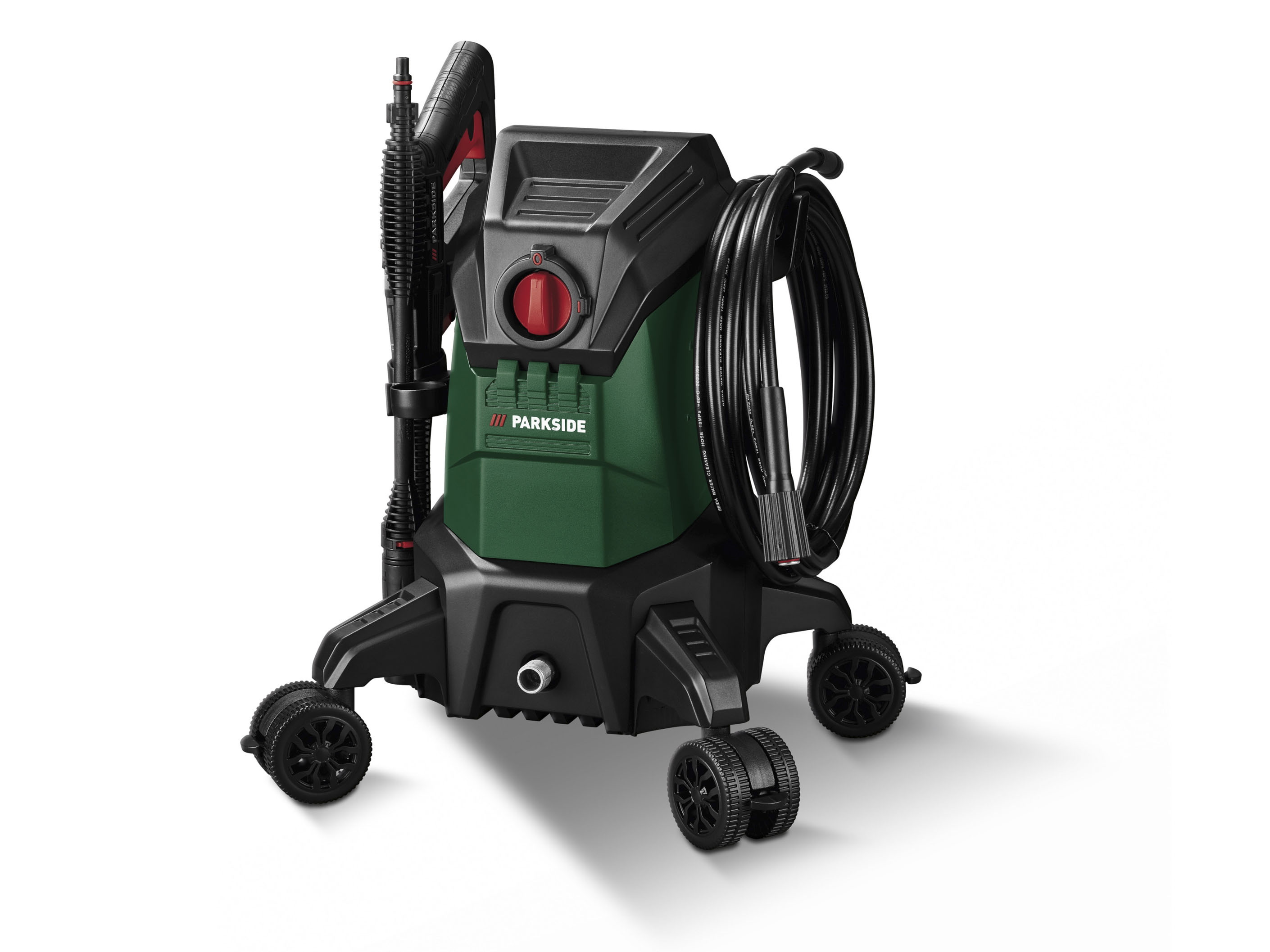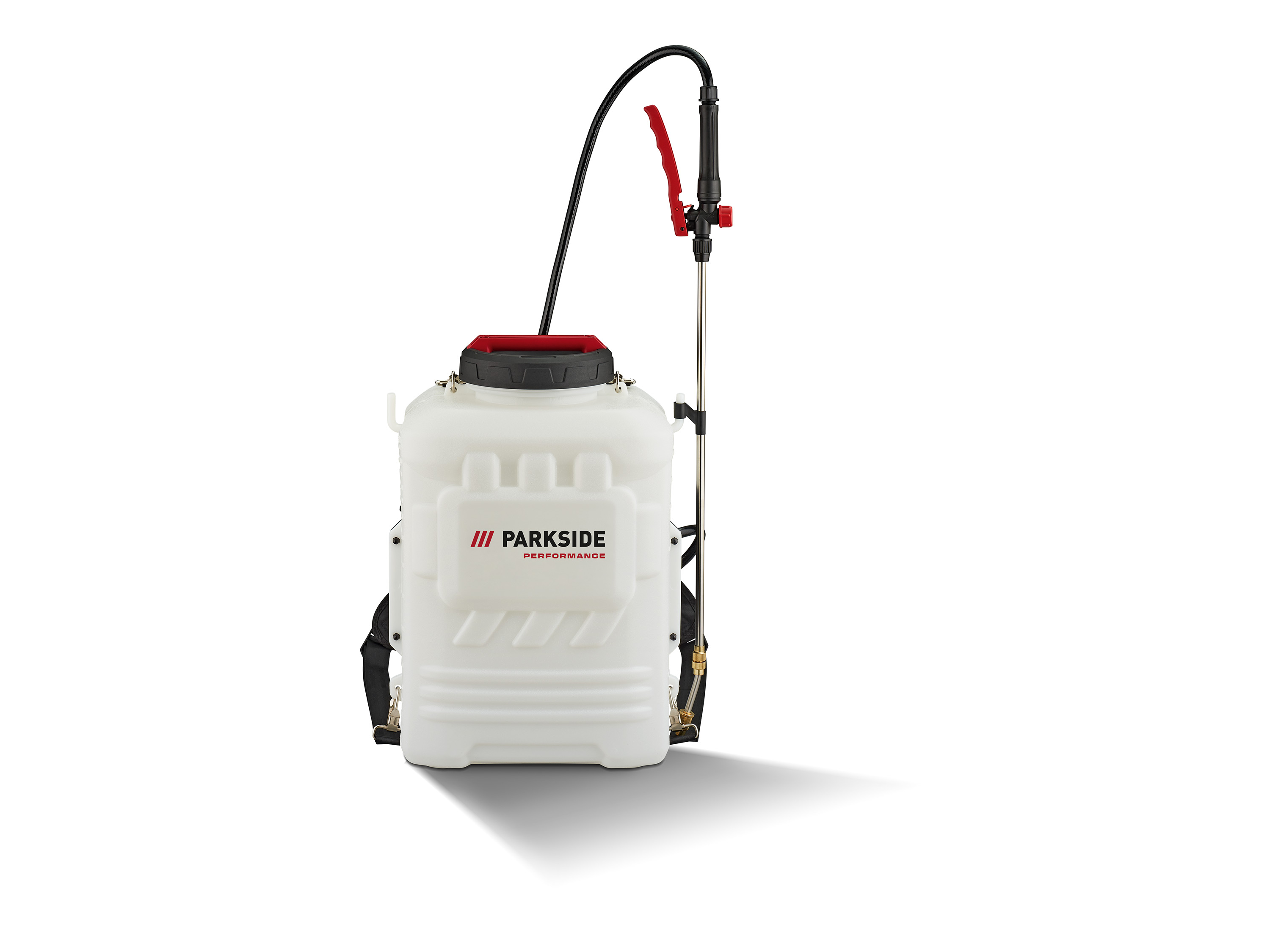
PARKSIDE PERFORMANCE® pulvérisateur à pression rechargeable sans fil prdsp 20-li c2, 20 v
Parkside performance® pulvérisateur à pression rechargeable sans fil prdsp 20-li c2, 20 vcaractéristiques idéal pour l’arrosage des jardins, le désherbage et la lutte contre les parasites ainsi que pour l’entretien des plantes convient également pour une utilisation avec des pesticides pulvérisation facile et permanente en cas d’utilisation des batteries smart parkside x 20 v paps : performance optimale grâce à la configuration personnalisée de l’appareil et au contrôle des données via l’application lidl home appareil performant avec panneau de saisie et de contrôle : pression de travail, état de la batterie et led de l’application smart pression de travail réglable en continu via l’application lidl home (2 - 6 bar) grand réservoir avec porte-lances et graduation système de portage sur le dos – ergonomique et rembourré utilisation facile grâce à un raccord de tuyau anti-pliage appareil compatible avec toutes les batteries de la série parkside x 20 v team livraison sans batterie ni chargeuraccessoires inclus : 1 lance télescopique en acier inoxydable, 1 lance en plastique, 1 buse à jet plat, 1 buse à tête simple, 1 buse à tête double, 1 buse de pulvérisation de brouillard, 1 bandoulièrecaractéristiques techniques pression de travail : 2 - 6 bar batterie recommandée : 20 v débit : minimum 61,5 l/hˡˡ capacité du réservoir : 16 l capacité de pulvérisation par charge de batterie : environ 320 lˡˡ température de fonctionnement : 40°c maximummatériauxacier inoxydable, plastiquedimensions pulvérisateur à pression rechargeable sans fil : environ 52,5 x 36 x 32,5 cm longueur du tuyau : environ 120 cmpoidsenviron 6,3 kg ˡˡ les informations dépendent toujours de la buse et du réglage de la pression.
retrouvez tous les appareils compatibles de notre série 20 volts ici :.
hybris_custom_container_1280 {max-width: 1280px;margin-right: auto;margin-bottom: 1.
5rem;margin-left: auto;padding-right: 0rem;padding-left: 0rem;font-size: 1rem;x7d.
hybris_custom_text_align_center {text-align: center;x7d.
width_60 {width: 60%;margin-right: auto;margin-left: auto;x7d.
height_24 {height: 2rem;x7d.
flexbox_custom_hybris {display: -webkit-box;display: -webkit-flex;display: -ms-flexbox;display: flex;x7d.
flexbox_custom_hybris.
flex_justify_hybris_space_between {-webkit-box-pack: justify;-webkit-justify-content: space-between;-ms-flex-pack: justify;justify-content: space-between;x7d.
flex_1_left {width: 50%;margin-top: auto;margin-bottom: auto;padding-right: 10px;text-align: center;x7d.
flex_1_right {width: 50%;margin-top: auto;margin-bottom: auto;padding-left: 10px;x7d.
bild_flexbox_links {border-radius: 10px;x7d.
flex_2_left {width: 50%;margin-top: auto;margin-bottom: auto;padding-right: 10px;x7d.
flex_2_right {width: 50%;margin-top: auto;margin-bottom: auto;padding-left: 10px;text-align: center;x7d.
rounded-corners {max-width: 100%;border-radius: 10px;x7d.
heading_h2_custom_hybris {margin-top: 0px;margin-bottom: 1rem;font-size: 1.
75rem;line-height: 30px;x7d.
heading_h3_custom_hybris {margin-top: 0px;margin-bottom: 0.
5rem;font-size: 1.
5rem;line-height: 1.
2;font-weight: 700;x7d.
width_full {margin-right: 0px;margin-bottom: 30px;margin-left: 0px;x7d.
width_full.
padding_around_15px {padding: 15px;x7d.
width_full.
padding_around_15px.
text_align_center {text-align: center;x7d.
width_30 {width: 30%;x7d.
w-embed:before,.
w-embed:after {content: ;display: table;grid-column-start: 1;grid-row-start: 1;grid-column-end: 2;grid-row-end: 2;x7d.
w-embed:after {clear: both;x7d.
w-video {width: 100%;position: relative;padding: 0;x7d.
w-video iframe,.
w-video embed {position: absolute;top: 0;left: 0;width: 100%;height: 100%;border: none;x7d.
width_30.
text_align_center {text-align: center;x7d.
image_hybris_features {max-width: 90%;margin-bottom: 0.
75rem;border-radius: 10px;x7d.
image_hybris_header_hochformat {width: 25%;max-width: 100%;border-radius: 10px;x7d.
image_hybris_header_querformat {width: 55%;max-width: 100%;border-radius: 10px;x7d.
bild_2er_flex {width: 50%;margin-top: auto;margin-bottom: auto;padding: 10px;x7d.
width_30-_4er_reihe {width: 30%;padding: 10px;x7d.
width_30-_4er_reihe.
text_align_center {text-align: center;x7d.
image_hybris_4er-features {max-width: 100%;margin-bottom: 0.
75rem;border-radius: 10px;x7d.
width_45 {width: 100%;x7d.
width_10 {width: 10%;x7d@media screen and (min-width: 1280px) {.
hybris_custom_container_1280 {font-size: 1.
125rem;x7d.
heading_h2_custom_hybris {font-size: 1.
875rem;line-height: 1.
2;font-weight: 700;x7d.
heading_h3_custom_hybris {font-size: 1.
625rem;x7dx7d@media screen and (max-width: 991px) {.
hybris_custom_container_1280 {max-width: 1280px;x7d.
width_60 {width: 70%;x7d.
flexbox_custom_hybris.
flex_justify_hybris_space_between.
tablet-wrap {-webkit-flex-wrap: wrap;-ms-flex-wrap: wrap;flex-wrap: wrap;x7d.
flex_1_left {width: 50%;x7d.
flex_1_right {width: 50%;x7d.
width_full {width: 70%;x7d.
image_hybris_header_hochformat {width: 30%;x7d.
image_hybris_header_querformat {width: 65%;x7d.
bild_2er_flex {width: 60%;x7d.
width_30-_4er_reihe {width: 45%;x7dx7d@media screen and (max-width: 767px) {.
width_60 {width: 80%;x7d.
height_24 {height: 2rem;x7d.
flexbox_custom_hybris {-webkit-box-orient: vertical;-webkit-box-direction: normal;-webkit-flex-direction: column;-ms-flex-direction: column;flex-direction: column;x7d.
flex_1_left {width: 100%;padding-right: 0px;text-align: center;x7d.
flex_1_right {width: 100%;padding-left: 0px;x7d.
flex_2_left {width: 100%;padding-right: 0px;x7d.
flex_2_right {width: 100%;padding-left: 0px;-webkit-box-ordinal-group: 0;-webkit-order: -1;-ms-flex-order: -1;order: -1;x7d.
width_full {width: 100%;x7d.
width_full.
padding_around_15px {padding-right: 0px;padding-left: 0px;x7d.
width_30 {width: 100%;margin-bottom: 30px;x7d.
image_hybris_features {max-width: 100%;x7d.
image_hybris_header_hochformat {width: 40%;x7d.
image_hybris_header_querformat {width: 75%;x7d.
bild_2er_flex {width: 100%;x7d.
width_30-_4er_reihe {width: 100%;margin-bottom: 30px;x7d.
image_hybris_4er-features {max-width: 100%;x7d.
centered {text-align: center;x7d.
icon_hybris_feature {max-width: 100%;x7d.
width_45 {margin-bottom: 30px;x7dx7d@media screen and (max-width: 479px) {.
width_60 {width: 100%;x7d.
height_24 {height: 1rem;x7d.
flex_1_left {padding-right: 0px;x7d.
bild_flexbox_links {width: 100%;x7d.
width_30 {margin-bottom: 40px;x7d.
image_hybris_header_hochformat {width: 55%;x7d.
image_hybris_header_querformat {width: 95%;x7d.
width_30-_4er_reihe {margin-bottom: 40px;x7dx7d.