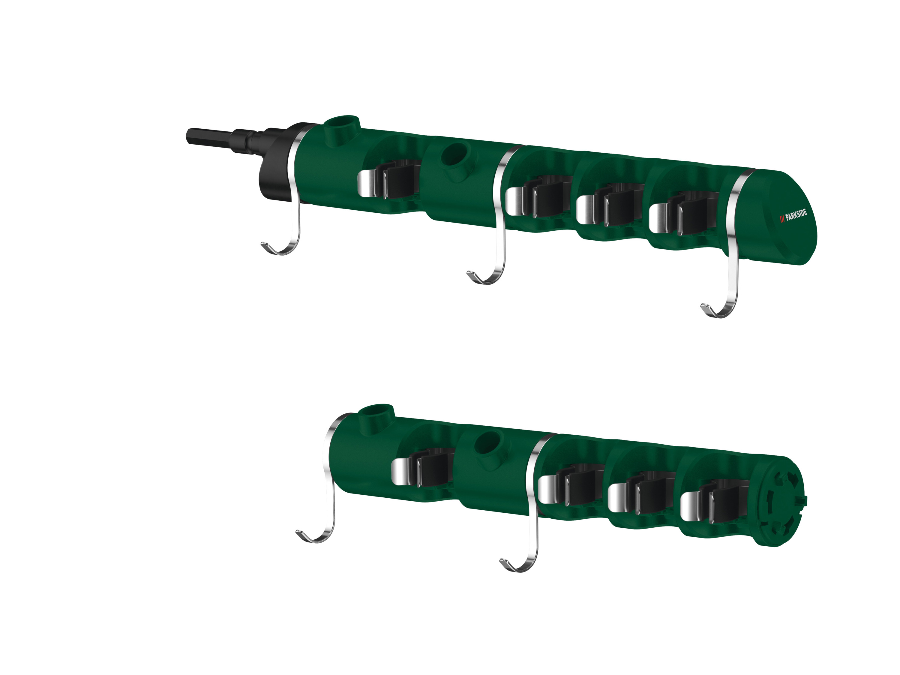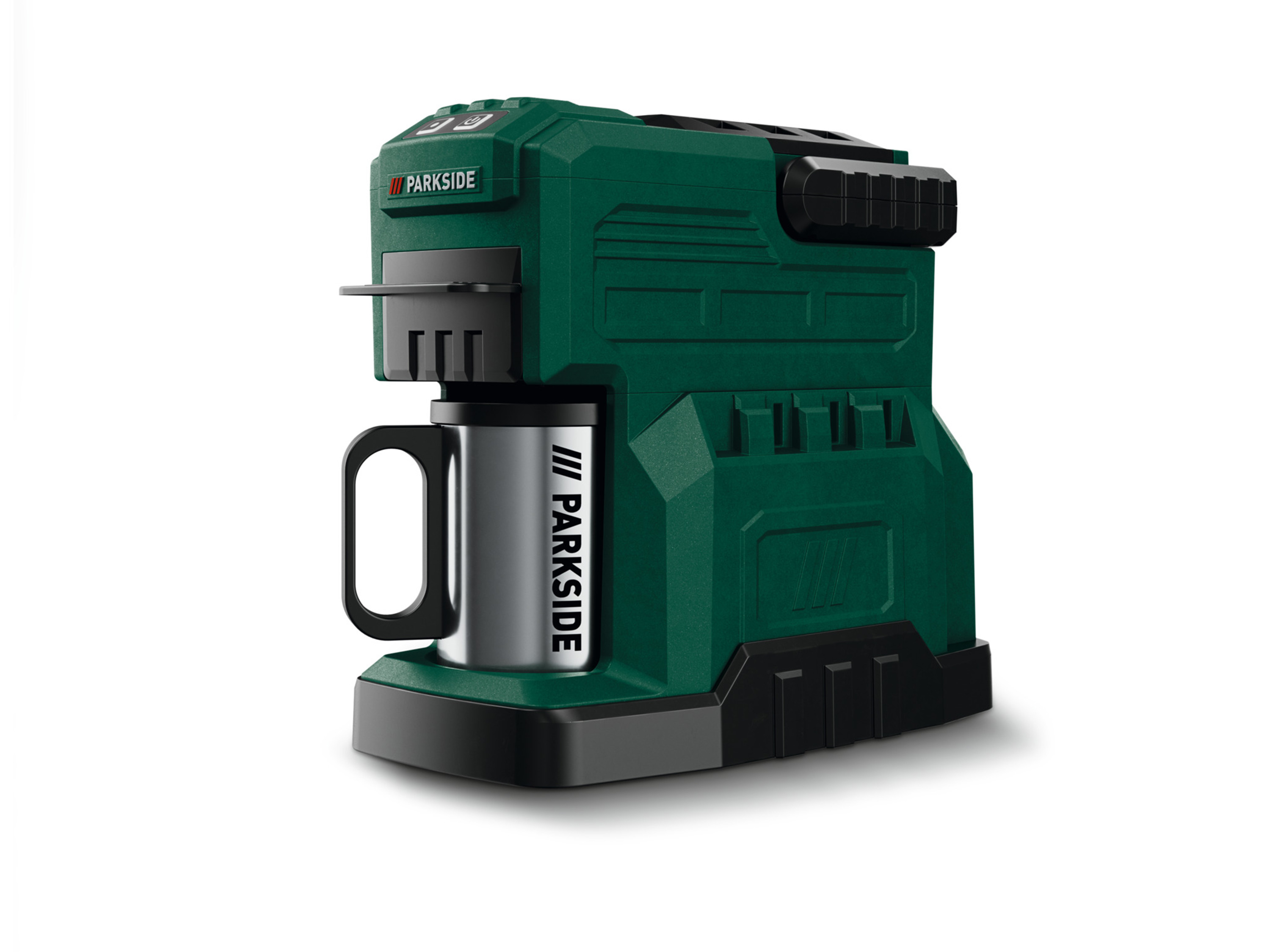
PARKSIDE® machine à café sans fil pkma 20-li a1, 20 v
Parkside® machine à café sans fil pkma 20-li a1, 20 vcaractéristiques du café frais partout – même sans prise de courant convient pour le café moulu et les dosettes de café boîtier solide avec poignée pour un transport facile - taille compacte pour un encombrement minimal pas besoin de filtre à café grâce à un filtre intégré avec support porte-dosettes adapté aux dosettes de café standard tasse assortie en acier inoxydable (avec couvercle - protection contre la poussière) et cuillère doseuse nombre de tasses à pleine charge (20 v / 4 ah) : maximum 4 tasses (de 150 ml chacune) réservoir à eau amovible – (maximum 240 ml) protection contre la surchauffe et arrêt automatique en cas de niveau d’eau insuffisant temps de préparation : environ 6 min capacité du réservoir d’eau : 240 ml appareil compatible avec toutes les batteries de la série « x 20 v team » batterie recommandée : 20 v (4 ah) batterie et chargeur non inclusvous pouvez commander ici la batterie et le chargeur appropriés accessoires inclus : porte-dosette, filtre intégré avec support, tasse en acier inoxydable avec couvercle, cuillère doseusecaractéristiques techniques tasses par charge de batterie (20 v / 4 ah) : jusqu'à 4 tasses (à 150 ml) capacité par charge de batterie (batterie 20 v) : environ 300 ml (2 ah) / environ 600 ml (4 ah) / environ 1200 ml (8 ah) tension : 20 v puissance maximale : 500 wmatériauxacier inoxydable, plastiquedimensionsenviron 14,1 x 25,3 x 22,7 cmpoidsenviron 1,4 kg vous trouverez ici tous les appareils compatibles de notre série 20 volts :.
hybris_custom_container_1280 {max-width: 1280px;margin-right: auto;margin-bottom: 1.
5rem;margin-left: auto;padding-right: 0rem;padding-left: 0rem;font-size: 1rem;x7d.
hybris_custom_text_align_center {text-align: center;x7d.
width_60 {width: 60%;margin-right: auto;margin-left: auto;x7d.
height_24 {height: 2rem;x7d.
flexbox_custom_hybris {display: -webkit-box;display: -webkit-flex;display: -ms-flexbox;display: flex;x7d.
flexbox_custom_hybris.
flex_justify_hybris_space_between {-webkit-box-pack: justify;-webkit-justify-content: space-between;-ms-flex-pack: justify;justify-content: space-between;x7d.
flex_1_left {width: 50%;margin-top: auto;margin-bottom: auto;padding-right: 10px;text-align: center;x7d.
flex_1_right {width: 50%;margin-top: auto;margin-bottom: auto;padding-left: 10px;x7d.
bild_flexbox_links {border-radius: 10px;x7d.
flex_2_left {width: 50%;margin-top: auto;margin-bottom: auto;padding-right: 10px;x7d.
flex_2_right {width: 50%;margin-top: auto;margin-bottom: auto;padding-left: 10px;text-align: center;x7d.
rounded-corners {max-width: 100%;border-radius: 10px;x7d.
heading_h2_custom_hybris {margin-top: 0px;margin-bottom: 1rem;font-size: 1.
75rem;line-height: 30px;x7d.
heading_h3_custom_hybris {margin-top: 0px;margin-bottom: 0.
5rem;font-size: 1.
5rem;line-height: 1.
2;font-weight: 700;x7d.
width_full {margin-right: 0px;margin-bottom: 30px;margin-left: 0px;x7d.
width_full.
padding_around_15px {padding: 15px;x7d.
width_full.
padding_around_15px.
text_align_center {text-align: center;x7d.
width_30 {width: 30%;x7d.
w-embed:before,.
w-embed:after {content: ;display: table;grid-column-start: 1;grid-row-start: 1;grid-column-end: 2;grid-row-end: 2;x7d.
w-embed:after {clear: both;x7d.
w-video {width: 100%;position: relative;padding: 0;x7d.
w-video iframe,.
w-video embed {position: absolute;top: 0;left: 0;width: 100%;height: 100%;border: none;x7d.
width_30.
text_align_center {text-align: center;x7d.
image_hybris_features {max-width: 90%;margin-bottom: 0.
75rem;border-radius: 10px;x7d.
image_hybris_header_hochformat {width: 25%;max-width: 100%;border-radius: 10px;x7d.
image_hybris_header_querformat {width: 55%;max-width: 100%;border-radius: 10px;x7d.
bild_2er_flex {width: 50%;margin-top: auto;margin-bottom: auto;padding: 10px;x7d.
width_30-_4er_reihe {width: 30%;padding: 10px;x7d.
width_30-_4er_reihe.
text_align_center {text-align: center;x7d.
image_hybris_4er-features {max-width: 100%;margin-bottom: 0.
75rem;border-radius: 10px;x7d.
width_45 {width: 100%;x7d.
width_10 {width: 10%;x7d@media screen and (min-width: 1280px) {.
hybris_custom_container_1280 {font-size: 1.
125rem;x7d.
heading_h2_custom_hybris {font-size: 1.
875rem;line-height: 1.
2;font-weight: 700;x7d.
heading_h3_custom_hybris {font-size: 1.
625rem;x7dx7d@media screen and (max-width: 991px) {.
hybris_custom_container_1280 {max-width: 1280px;x7d.
width_60 {width: 70%;x7d.
flexbox_custom_hybris.
flex_justify_hybris_space_between.
tablet-wrap {-webkit-flex-wrap: wrap;-ms-flex-wrap: wrap;flex-wrap: wrap;x7d.
flex_1_left {width: 50%;x7d.
flex_1_right {width: 50%;x7d.
width_full {width: 70%;x7d.
image_hybris_header_hochformat {width: 30%;x7d.
image_hybris_header_querformat {width: 65%;x7d.
bild_2er_flex {width: 60%;x7d.
width_30-_4er_reihe {width: 45%;x7dx7d@media screen and (max-width: 767px) {.
width_60 {width: 80%;x7d.
height_24 {height: 2rem;x7d.
flexbox_custom_hybris {-webkit-box-orient: vertical;-webkit-box-direction: normal;-webkit-flex-direction: column;-ms-flex-direction: column;flex-direction: column;x7d.
flex_1_left {width: 100%;padding-right: 0px;text-align: center;x7d.
flex_1_right {width: 100%;padding-left: 0px;x7d.
flex_2_left {width: 100%;padding-right: 0px;x7d.
flex_2_right {width: 100%;padding-left: 0px;-webkit-box-ordinal-group: 0;-webkit-order: -1;-ms-flex-order: -1;order: -1;x7d.
width_full {width: 100%;x7d.
width_full.
padding_around_15px {padding-right: 0px;padding-left: 0px;x7d.
width_30 {width: 100%;margin-bottom: 30px;x7d.
image_hybris_features {max-width: 100%;x7d.
image_hybris_header_hochformat {width: 40%;x7d.
image_hybris_header_querformat {width: 75%;x7d.
bild_2er_flex {width: 100%;x7d.
width_30-_4er_reihe {width: 100%;margin-bottom: 30px;x7d.
image_hybris_4er-features {max-width: 100%;x7d.
centered {text-align: center;x7d.
icon_hybris_feature {max-width: 100%;x7d.
width_45 {margin-bottom: 30px;x7dx7d@media screen and (max-width: 479px) {.
width_60 {width: 100%;x7d.
height_24 {height: 1rem;x7d.
flex_1_left {padding-right: 0px;x7d.
bild_flexbox_links {width: 100%;x7d.
width_30 {margin-bottom: 40px;x7d.
image_hybris_header_hochformat {width: 55%;x7d.
image_hybris_header_querformat {width: 95%;x7d.
width_30-_4er_reihe {margin-bottom: 40px;x7dx7d.
Information produit
| Ah) | Maximum 4 tasses (de 150 ml chacune)reservoir a eau amovible (maximum 240 ml)protection contre la surchauffe et arret automatique en cas de niveau deau insuffisanttemps de preparationenviron 6 mincapacite du reservoir deau240 mlappareil compatible avec toutes les batteries de la serie x 20 v team batterie recommandee20 v (4 ah)batterie et chargeur non inclusvous pouvez commander ici la batterie et le chargeur appropries accessoires inclusportedosette filtre integre avec support tasse en acier inoxydable avec couvercle cuillere doseusecaracteristiques techniquestasses par charge de batterie (20 v 4 ah)jusqu39 |
|---|---|
| A 4 tasses (a 150 ml) capacite par charge de batterie (batterie 20 v) | Environ 300 ml (2 ah) environ 600 ml (4 ah) environ 1200 ml (8 ah) tension20 vpuissance maximale500 wmateriauxacier inoxydable plastiquedimensionsenviron 141 x 253 x 227 cmpoidsenviron 14 kg vous trouverez ici tous les appareils compatibles de notre serie 20 voltshybriscustomcontainer1280 maxwidth1280px |
| Margin-right | Auto Auto |
| Margin-bottom | 15rem Auto Auto Auto Auto 1rem 05rem 30px 075rem Auto 075rem 30px 30px |
| Margin-left | Auto Auto 0px |
| Padding-right | 0rem 10px 10px 0px 0px |
| Padding-left | 0rem 10px 10px 0px 0px 0px |
| Font-size | 1rem 175rem 15rem |
| X7d.hybris_custom_text_align_center {text-align | Center |
| X7d.width_60 {width | 60 70 |
| X7d.height_24 {height | 2rem 2rem 1rem |
| X7d.flexbox_custom_hybris {display | Webkitbox |
| Display | Webkitflex Msflexbox Flex Table |
| X7d.flexbox_custom_hybris.flex_justify_hybris_space_between {-webkit-box-pack | Justify |
| -webkit-justify-content | Spacebetween |
| -ms-flex-pack | Justify |
| Justify-content | Spacebetween |
| X7d.flex_1_left {width | 50 50 100 |
| Margin-top | Auto Auto Auto Auto Auto |
| Text-align | Center Center Center |
| X7d.flex_1_right {width | 50 50 100 |
| X7d.bild_flexbox_links {border-radius | 10px |
| X7d.flex_2_left {width | 50 100 |
| X7d.flex_2_right {width | 50 100 |
| X7d.rounded-corners {max-width | 100 |
| Border-radius | 10px 10px 10px 10px 10px |
| X7d.heading_h2_custom_hybris {margin-top | 0px |
| Line-height | 30px 12 12 |
| X7d.heading_h3_custom_hybris {margin-top | 0px |
| Font-weight | 700 700 |
| X7d.width_full {margin-right | 0px |
| X7d.width_full.padding_around_15px {padding | 15px |
| X7d.width_full.padding_around_15px.text_align_center {text-align | Center |
| X7d.width_30 {width | 30 100 |
| X7d.w-embed | Before wembedafter content After clearboth |
| Grid-column-start | 1 |
| Grid-row-start | 1 |
| Grid-column-end | 2 |
| Grid-row-end | 2 |
| X7d.w-video {width | 100 |
| Position | Relative |
| Padding | 0 10px 10px |
| X7d.w-video iframe, .w-video embed {position | Absolute |
| Top | 0 |
| Left | 0 |
| Width | 100 |
| Height | 100 |
| Border | None |
| X7d.width_30.text_align_center {text-align | Center |
| X7d.image_hybris_features {max-width | 90 100 |
| X7d.image_hybris_header_hochformat {width | 25 30 40 55 |
| Max-width | 100 100 |
| X7d.image_hybris_header_querformat {width | 55 65 75 95 |
| X7d.bild_2er_flex {width | 50 60 100 |
| X7d.width_30-_4er_reihe {width | 30 45 100 |
| X7d.width_30-_4er_reihe.text_align_center {text-align | Center |
| X7d.image_hybris_4er-features {max-width | 100 100 |
| X7d.width_45 {width | 100 |
| X7d.width_10 {width | 10 |
| X7d@media screen and (min-width | 1280px) hybriscustomcontainer1280 fontsize1125rem |
| X7d.heading_h2_custom_hybris {font-size | 1875rem |
| X7d.heading_h3_custom_hybris {font-size | 1625rem |
| X7dx7d@media screen and (max-width | 991px) hybriscustomcontainer1280 maxwidth1280px 767px) width60 width80 479px) width60 width100 |
| X7d.flexbox_custom_hybris.flex_justify_hybris_space_between.tablet-wrap {-webkit-flex-wrap | Wrap |
| -ms-flex-wrap | Wrap |
| Flex-wrap | Wrap |
| X7d.width_full {width | 70 100 |
| X7d.flexbox_custom_hybris {-webkit-box-orient | Vertical |
| -webkit-box-direction | Normal |
| -webkit-flex-direction | Column |
| -ms-flex-direction | Column |
| Flex-direction | Column |
| -webkit-box-ordinal-group | 0 |
| -webkit-order | 1 |
| -ms-flex-order | 1 |
| Order | 1 |
| X7d.width_full.padding_around_15px {padding-right | 0px |
| X7d.centered {text-align | Center |
| X7d.icon_hybris_feature {max-width | 100 |
| X7d.width_45 {margin-bottom | 30px |
| X7d.flex_1_left {padding-right | 0px |
| X7d.bild_flexbox_links {width | 100 |
| X7d.width_30 {margin-bottom | 40px |
| X7d.width_30-_4er_reihe {margin-bottom | 40px |