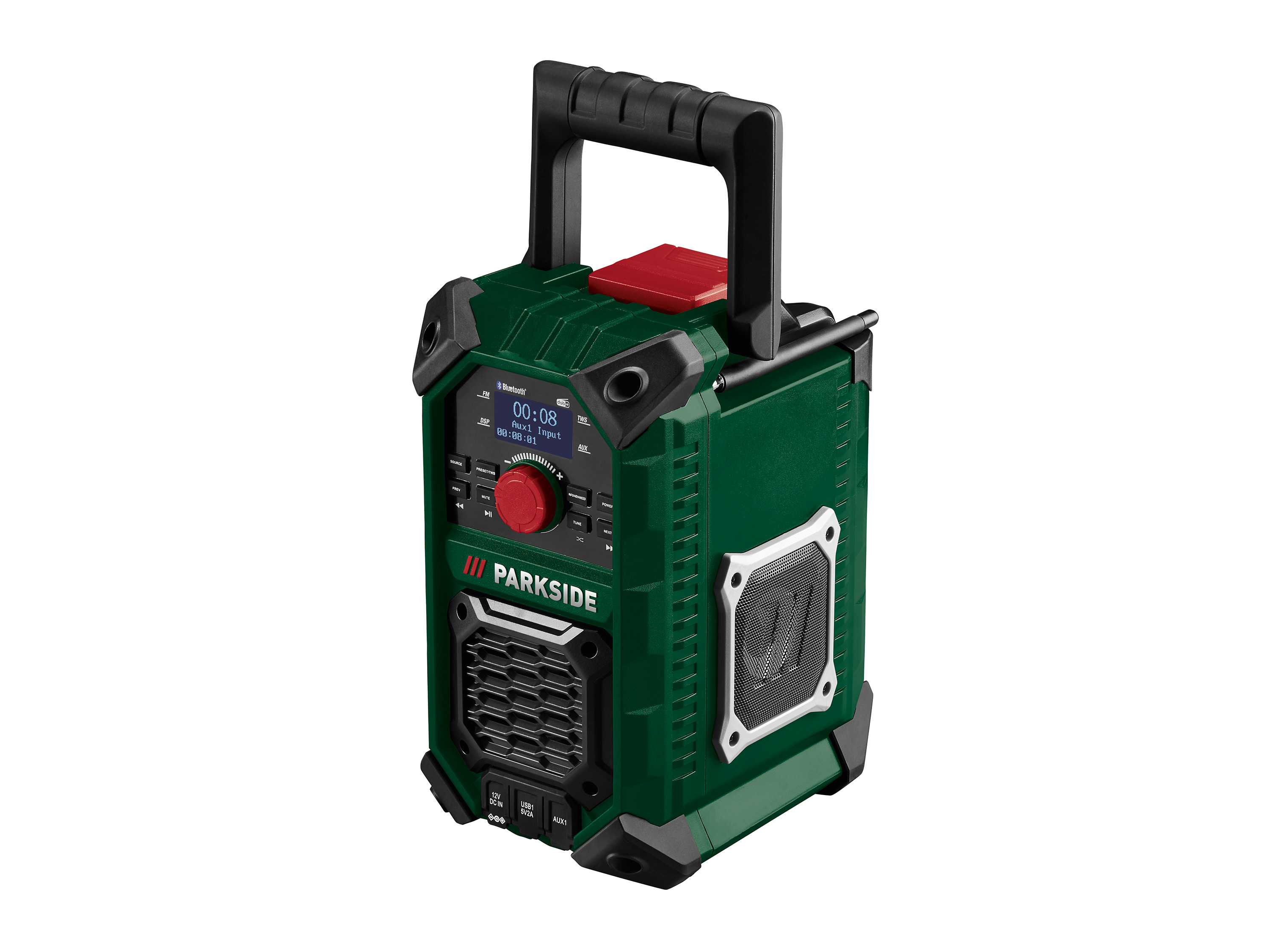
PARKSIDE® radio de chantier sans fil pbra 20-li b2, 20 v
Parkside® radio de chantier sans fil pbra 20-li b2, 20 vcaractéristiques compagnon idéal sur le chantier, au camping ou dans le jardin radio fm stéréo pour la réception de dab, dab+ et fm possibilité de streaming musical sans fil via bluetooth®.
haut-parleurs de haute qualité avec un son clair et agréable recherche automatique des stations et 30 emplacements de mémoire grand écran lcd avec rétroéclairage et affichage de l'état de la batterie 2 ports usb : 1x pour charger par ex.
un téléphone portable ou une tablette et 1x pour écouter de la musique possibilité d'écouter sa propre musique via 2 prises aux affichage de la date et de l'heure boîtier robuste avec bords caoutchoutés et poignée de transport dépliable adaptateur secteur inclus pour une utilisation immédiate fonctionnement possible par bloc d'alimentation ou batterie appareil compatible avec toutes les batteries de la série parkside x 12 et 20 v team ou peut être utilisé avec un bloc d'alimentation sur une prise de courant.
batterie et chargeur non-inclus accessoires inclus : 1 adaptateur secteur, 1 câble aux.
caractéristiques techniques possibilités de réception : dab / dab+ / fm recherche de stations : automatique et manuelle possibilité de mémoriser des stations : 30 autonomie en fonctionnement sur batterie : 12 v (2 ah) environ 7 h 12 v (4 ah) environ 14 h 12 v (5 ah) environ 18 h 20 v (2 ah) environ 5 h 20 v (4 ah) environ 10 h 20 v (8 ah) environ 20 h puissance du haut-parleur : 2 x 5 w bluetooth® : portée maximale de 10 m écran : écran à cristaux liquides matériauplastiquedimensions appareil : environ 22,5 x 17 x 30 longueur du câble d'alimentation : environ 1,8 m poidsenviron 2,575 kg (sans batterie) retrouvez tous les appareils compatibles de notre série 20 volts ici :.
hybris_custom_container_1280 {max-width: 1280px;margin-right: auto;margin-bottom: 1.
5rem;margin-left: auto;padding-right: 0rem;padding-left: 0rem;font-size: 1rem;x7d.
hybris_custom_text_align_center {text-align: center;x7d.
width_60 {width: 60%;margin-right: auto;margin-left: auto;x7d.
height_24 {height: 2rem;x7d.
flexbox_custom_hybris {display: -webkit-box;display: -webkit-flex;display: -ms-flexbox;display: flex;x7d.
flexbox_custom_hybris.
flex_justify_hybris_space_between {-webkit-box-pack: justify;-webkit-justify-content: space-between;-ms-flex-pack: justify;justify-content: space-between;x7d.
flex_1_left {width: 50%;margin-top: auto;margin-bottom: auto;padding-right: 10px;text-align: center;x7d.
flex_1_right {width: 50%;margin-top: auto;margin-bottom: auto;padding-left: 10px;x7d.
bild_flexbox_links {border-radius: 10px;x7d.
flex_2_left {width: 50%;margin-top: auto;margin-bottom: auto;padding-right: 10px;x7d.
flex_2_right {width: 50%;margin-top: auto;margin-bottom: auto;padding-left: 10px;text-align: center;x7d.
rounded-corners {max-width: 100%;border-radius: 10px;x7d.
heading_h2_custom_hybris {margin-top: 0px;margin-bottom: 1rem;font-size: 1.
75rem;line-height: 30px;x7d.
heading_h3_custom_hybris {margin-top: 0px;margin-bottom: 0.
5rem;font-size: 1.
5rem;line-height: 1.
2;font-weight: 700;x7d.
width_full {margin-right: 0px;margin-bottom: 30px;margin-left: 0px;x7d.
width_full.
padding_around_15px {padding: 15px;x7d.
width_full.
padding_around_15px.
text_align_center {text-align: center;x7d.
width_30 {width: 30%;x7d.
w-embed:before,.
w-embed:after {content: ;display: table;grid-column-start: 1;grid-row-start: 1;grid-column-end: 2;grid-row-end: 2;x7d.
w-embed:after {clear: both;x7d.
w-video {width: 100%;position: relative;padding: 0;x7d.
w-video iframe,.
w-video embed {position: absolute;top: 0;left: 0;width: 100%;height: 100%;border: none;x7d.
width_30.
text_align_center {text-align: center;x7d.
image_hybris_features {max-width: 90%;margin-bottom: 0.
75rem;border-radius: 10px;x7d.
image_hybris_header_hochformat {width: 25%;max-width: 100%;border-radius: 10px;x7d.
image_hybris_header_querformat {width: 55%;max-width: 100%;border-radius: 10px;x7d.
bild_2er_flex {width: 50%;margin-top: auto;margin-bottom: auto;padding: 10px;x7d.
width_30-_4er_reihe {width: 30%;padding: 10px;x7d.
width_30-_4er_reihe.
text_align_center {text-align: center;x7d.
image_hybris_4er-features {max-width: 100%;margin-bottom: 0.
75rem;border-radius: 10px;x7d.
width_45 {width: 100%;x7d.
width_10 {width: 10%;x7d@media screen and (min-width: 1280px) {.
hybris_custom_container_1280 {font-size: 1.
125rem;x7d.
heading_h2_custom_hybris {font-size: 1.
875rem;line-height: 1.
2;font-weight: 700;x7d.
heading_h3_custom_hybris {font-size: 1.
625rem;x7dx7d@media screen and (max-width: 991px) {.
hybris_custom_container_1280 {max-width: 1280px;x7d.
width_60 {width: 70%;x7d.
flexbox_custom_hybris.
flex_justify_hybris_space_between.
tablet-wrap {-webkit-flex-wrap: wrap;-ms-flex-wrap: wrap;flex-wrap: wrap;x7d.
flex_1_left {width: 50%;x7d.
flex_1_right {width: 50%;x7d.
width_full {width: 70%;x7d.
image_hybris_header_hochformat {width: 30%;x7d.
image_hybris_header_querformat {width: 65%;x7d.
bild_2er_flex {width: 60%;x7d.
width_30-_4er_reihe {width: 45%;x7dx7d@media screen and (max-width: 767px) {.
width_60 {width: 80%;x7d.
height_24 {height: 2rem;x7d.
flexbox_custom_hybris {-webkit-box-orient: vertical;-webkit-box-direction: normal;-webkit-flex-direction: column;-ms-flex-direction: column;flex-direction: column;x7d.
flex_1_left {width: 100%;padding-right: 0px;text-align: center;x7d.
flex_1_right {width: 100%;padding-left: 0px;x7d.
flex_2_left {width: 100%;padding-right: 0px;x7d.
flex_2_right {width: 100%;padding-left: 0px;-webkit-box-ordinal-group: 0;-webkit-order: -1;-ms-flex-order: -1;order: -1;x7d.
width_full {width: 100%;x7d.
width_full.
padding_around_15px {padding-right: 0px;padding-left: 0px;x7d.
width_30 {width: 100%;margin-bottom: 30px;x7d.
image_hybris_features {max-width: 100%;x7d.
image_hybris_header_hochformat {width: 40%;x7d.
image_hybris_header_querformat {width: 75%;x7d.
bild_2er_flex {width: 100%;x7d.
width_30-_4er_reihe {width: 100%;margin-bottom: 30px;x7d.
image_hybris_4er-features {max-width: 100%;x7d.
centered {text-align: center;x7d.
icon_hybris_feature {max-width: 100%;x7d.
width_45 {margin-bottom: 30px;x7dx7d@media screen and (max-width: 479px) {.
width_60 {width: 100%;x7d.
height_24 {height: 1rem;x7d.
flex_1_left {padding-right: 0px;x7d.
bild_flexbox_links {width: 100%;x7d.
width_30 {margin-bottom: 40px;x7d.
image_hybris_header_hochformat {width: 55%;x7d.
image_hybris_header_querformat {width: 95%;x7d.
width_30-_4er_reihe {margin-bottom: 40px;x7dx7d.
Information produit
| Usb | 1x pour charger par ex un telephone portable ou une tablette et 1x pour ecouter de la musiquepossibilite d39 |
|---|---|
| Alimentation sur une prise de courant. batterie et chargeur non-inclus accessoires inclus | 1 adaptateur secteur 1 cable auxcaracteristiques techniquespossibilites de receptiondab dab fmrecherche de stationsautomatique et manuellepossibilite de memoriser des stations30autonomie en fonctionnement sur batterie12 v (2 ah) environ 7 h12 v (4 ah) environ 14 h12 v (5 ah) environ 18 h20 v (2 ah) environ 5 h20 v (4 ah) environ 10 h20 v (8 ah) environ 20 hpuissance du hautparleur2 x 5 w bluetoothportee maximale de 10 m ecranecran a cristaux liquides materiauplastiquedimensions appareilenviron 225 x 17 x 30longueur du cable d39 |
| Alimentation | Environ 18 m poidsenviron 2575 kg (sans batterie) retrouvez tous les appareils compatibles de notre serie 20 volts icihybriscustomcontainer1280 maxwidth1280px |
| Margin-right | Auto Auto |
| Margin-bottom | 15rem Auto Auto Auto Auto 1rem 05rem 30px 075rem Auto 075rem 30px 30px |
| Margin-left | Auto Auto 0px |
| Padding-right | 0rem 10px 10px 0px 0px |
| Padding-left | 0rem 10px 10px 0px 0px 0px |
| Font-size | 1rem 175rem 15rem |
| X7d.hybris_custom_text_align_center {text-align | Center |
| X7d.width_60 {width | 60 70 |
| X7d.height_24 {height | 2rem 2rem 1rem |
| X7d.flexbox_custom_hybris {display | Webkitbox |
| Display | Webkitflex Msflexbox Flex Table |
| X7d.flexbox_custom_hybris.flex_justify_hybris_space_between {-webkit-box-pack | Justify |
| -webkit-justify-content | Spacebetween |
| -ms-flex-pack | Justify |
| Justify-content | Spacebetween |
| X7d.flex_1_left {width | 50 50 100 |
| Margin-top | Auto Auto Auto Auto Auto |
| Text-align | Center Center Center |
| X7d.flex_1_right {width | 50 50 100 |
| X7d.bild_flexbox_links {border-radius | 10px |
| X7d.flex_2_left {width | 50 100 |
| X7d.flex_2_right {width | 50 100 |
| X7d.rounded-corners {max-width | 100 |
| Border-radius | 10px 10px 10px 10px 10px |
| X7d.heading_h2_custom_hybris {margin-top | 0px |
| Line-height | 30px 12 12 |
| X7d.heading_h3_custom_hybris {margin-top | 0px |
| Font-weight | 700 700 |
| X7d.width_full {margin-right | 0px |
| X7d.width_full.padding_around_15px {padding | 15px |
| X7d.width_full.padding_around_15px.text_align_center {text-align | Center |
| X7d.width_30 {width | 30 100 |
| X7d.w-embed | Before wembedafter content After clearboth |
| Grid-column-start | 1 |
| Grid-row-start | 1 |
| Grid-column-end | 2 |
| Grid-row-end | 2 |
| X7d.w-video {width | 100 |
| Position | Relative |
| Padding | 0 10px 10px |
| X7d.w-video iframe, .w-video embed {position | Absolute |
| Top | 0 |
| Left | 0 |
| Width | 100 |
| Height | 100 |
| Border | None |
| X7d.width_30.text_align_center {text-align | Center |
| X7d.image_hybris_features {max-width | 90 100 |
| X7d.image_hybris_header_hochformat {width | 25 30 40 55 |
| Max-width | 100 100 |
| X7d.image_hybris_header_querformat {width | 55 65 75 95 |
| X7d.bild_2er_flex {width | 50 60 100 |
| X7d.width_30-_4er_reihe {width | 30 45 100 |
| X7d.width_30-_4er_reihe.text_align_center {text-align | Center |
| X7d.image_hybris_4er-features {max-width | 100 100 |
| X7d.width_45 {width | 100 |
| X7d.width_10 {width | 10 |
| X7d@media screen and (min-width | 1280px) hybriscustomcontainer1280 fontsize1125rem |
| X7d.heading_h2_custom_hybris {font-size | 1875rem |
| X7d.heading_h3_custom_hybris {font-size | 1625rem |
| X7dx7d@media screen and (max-width | 991px) hybriscustomcontainer1280 maxwidth1280px 767px) width60 width80 479px) width60 width100 |
| X7d.flexbox_custom_hybris.flex_justify_hybris_space_between.tablet-wrap {-webkit-flex-wrap | Wrap |
| -ms-flex-wrap | Wrap |
| Flex-wrap | Wrap |
| X7d.width_full {width | 70 100 |
| X7d.flexbox_custom_hybris {-webkit-box-orient | Vertical |
| -webkit-box-direction | Normal |
| -webkit-flex-direction | Column |
| -ms-flex-direction | Column |
| Flex-direction | Column |
| -webkit-box-ordinal-group | 0 |
| -webkit-order | 1 |
| -ms-flex-order | 1 |
| Order | 1 |
| X7d.width_full.padding_around_15px {padding-right | 0px |
| X7d.centered {text-align | Center |
| X7d.icon_hybris_feature {max-width | 100 |
| X7d.width_45 {margin-bottom | 30px |
| X7d.flex_1_left {padding-right | 0px |
| X7d.bild_flexbox_links {width | 100 |
| X7d.width_30 {margin-bottom | 40px |
| X7d.width_30-_4er_reihe {margin-bottom | 40px |